|
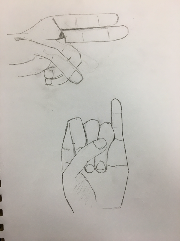
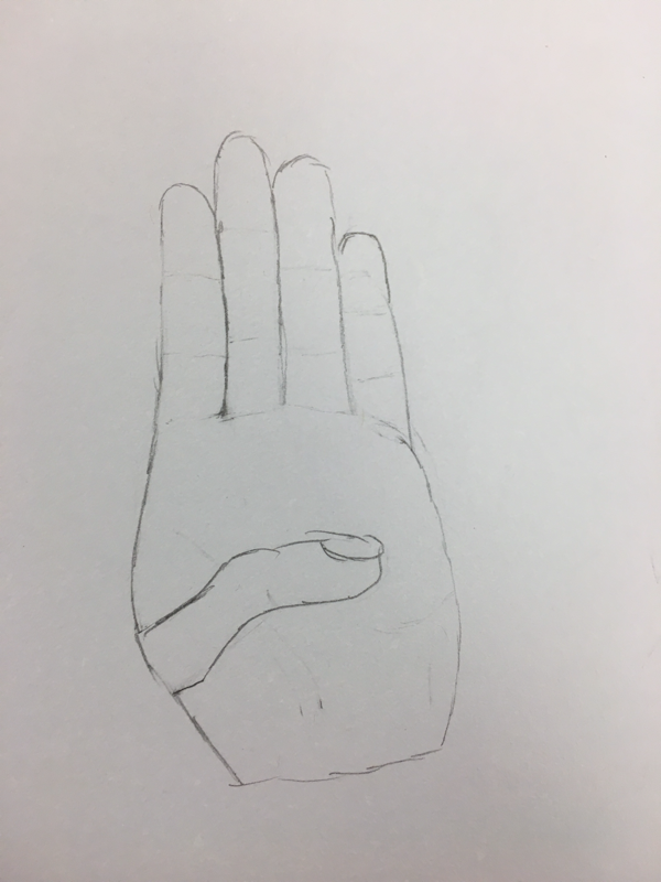
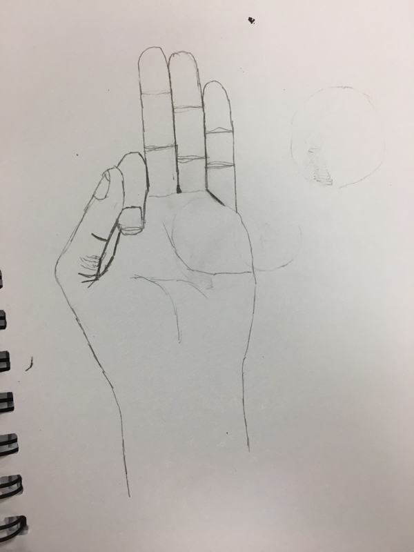
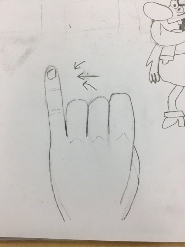
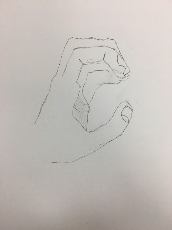
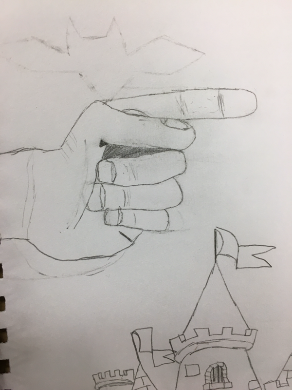
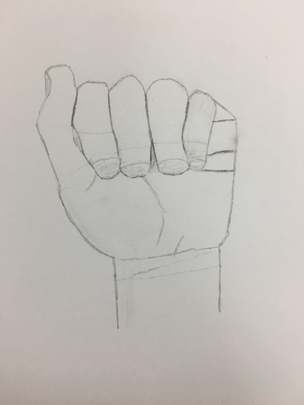
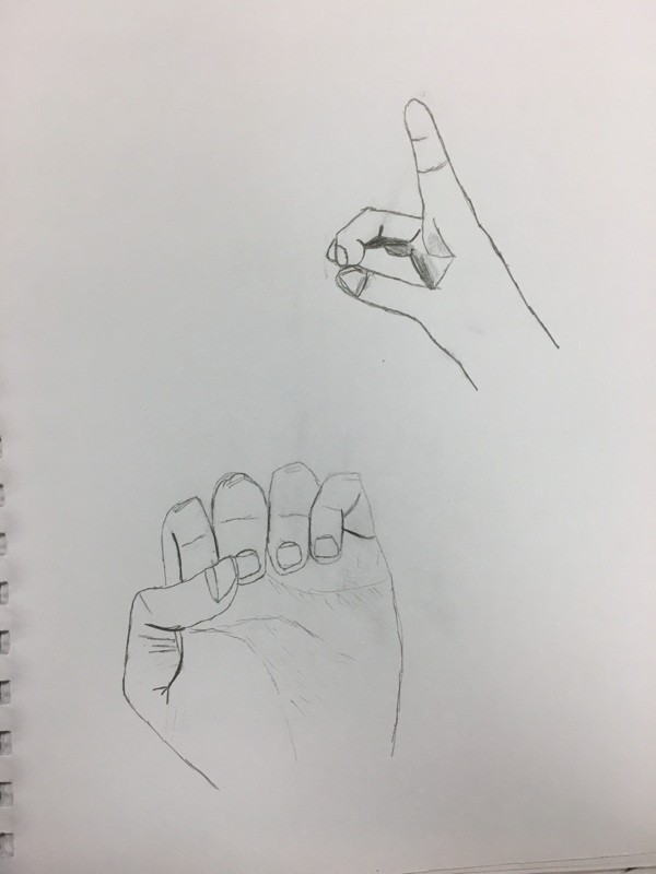
1. The first step in the art criticism process is describe the artwork. You need to list the images you see, shapes, etc. The second step is analyze the artwork. In this step you need to say what colors, values, shapes, texture, balance, or movement that you can see. The third step is to interpret the artwork. This part is where you have to describe the mood, feelings, or what ideas are represented. In the last step you judge the artwork. For this you need to support opinions with evidence or criteria. You have to find the goods and bads in the art. 2. Describe: I can see that this is a baseball with lots of stippling. Analyze: The shape of the art is a circle, with shadow. It's made up of only dots (stippling). The color of the dots are black. Interpret: In this piece there isn't really a mood. It's just a general object. Judge: The stippling for the shape of the ball could be more circleish. There are certain areas where it's kind of squiggly. The shadow on it looks good and helps the baseball look 3D.  3. (1) Art is the expression or application of human creative skill and imagination, typically in a visual form such as painting or sculpture. It's producing works to be appreciated mostly for their beauty or emotional power. Not all art is the same. People create art to be free, or themselves. (8) I learned the most from the sign language warm ups. The drawings helped me just practice the shapes you can use to create the hand. Throughout all of them, you can definitely see improvement. The first letter was probably the hardest (worst) drawing but only because I've never done it before. (14) For the clay project, I created a baseball. I used coiling on the outside to create the seams and used a paper ball on the inside for the shape. This was successful because you can see what I made. The coils add a little bit more 3D. 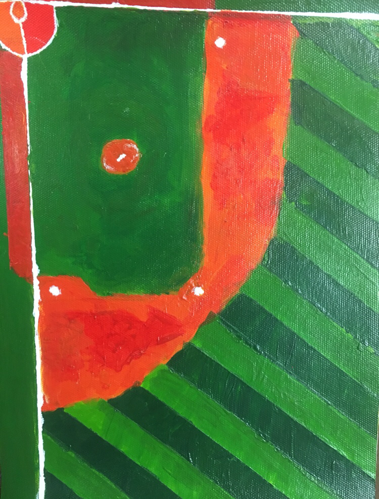 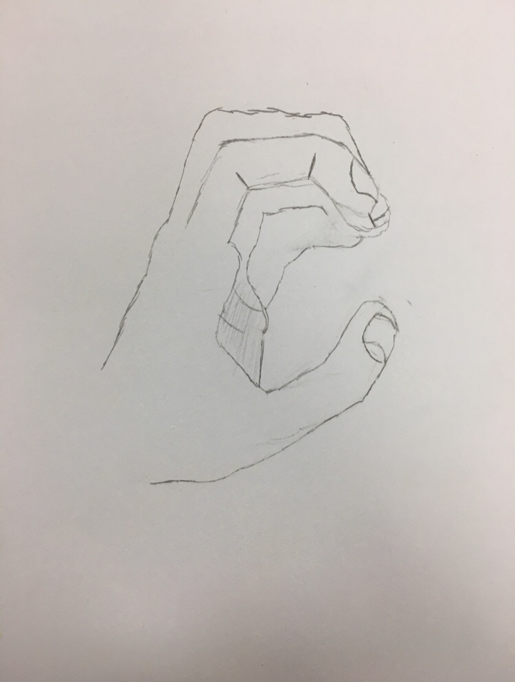 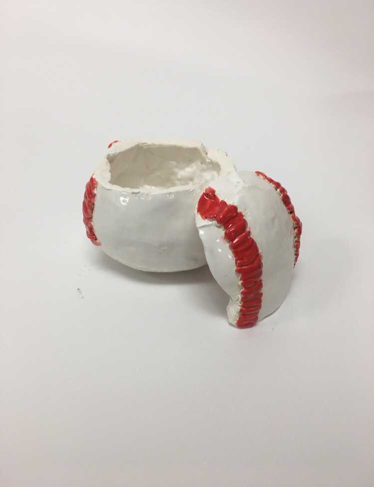
0 Comments
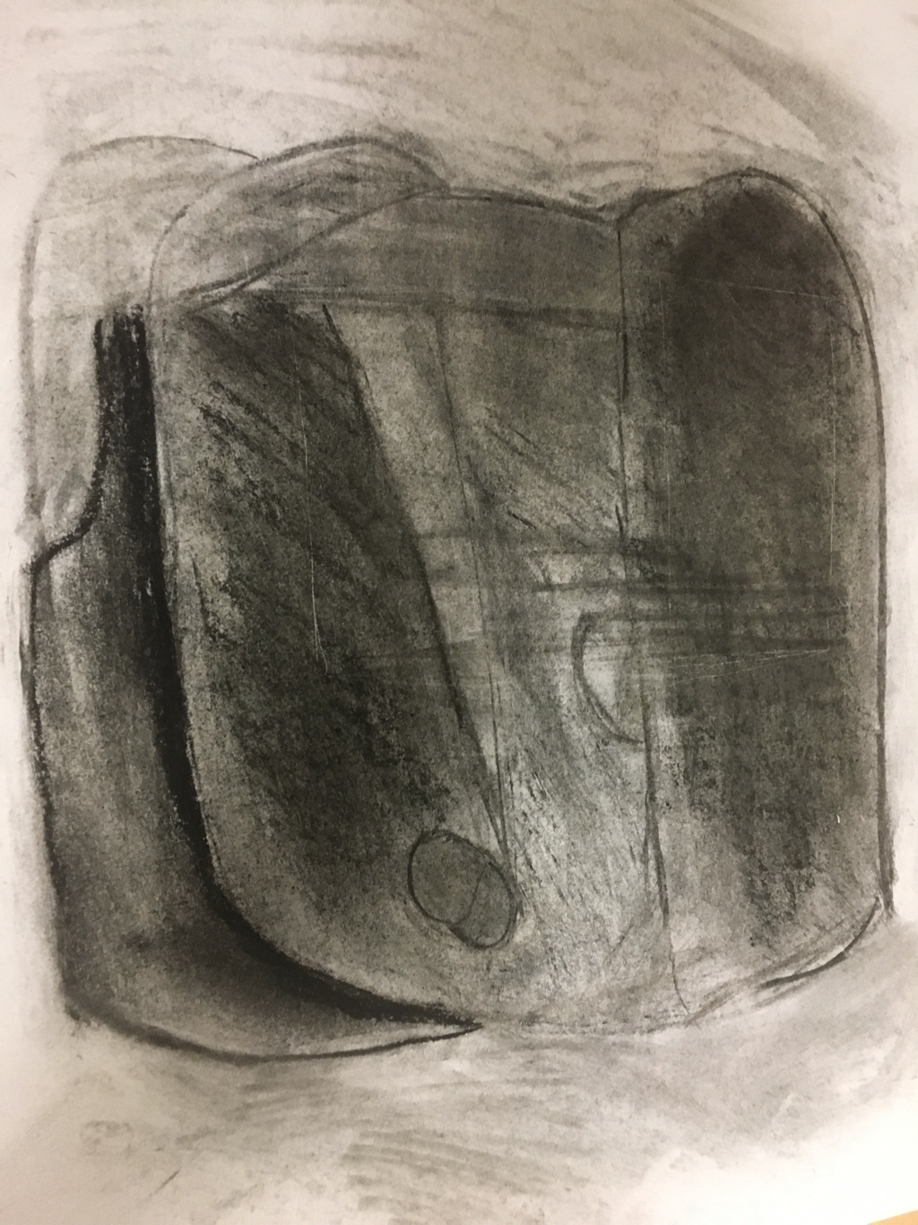
1. My piece represents the theme "line". The thing I did was the baseball team Indians logo because I'm from Ohio. It shows all the different lines that are curved. 2. My piece is successful because it was carved out good. It wasn't too hard to cut out all the strips. What I'd probably change is how much paint I use because it's large. 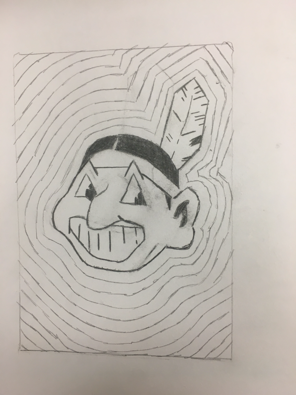 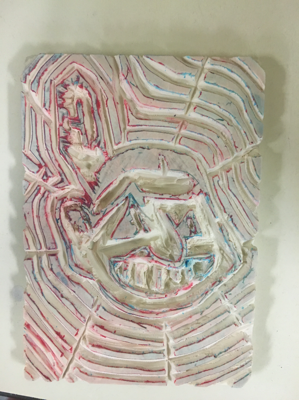 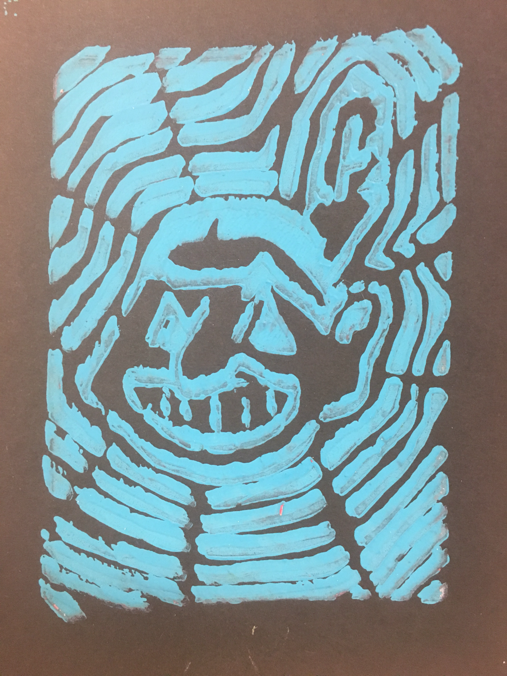 1. I used 3-point perspective in my art. 2. This photo is of the Washington Moniment in Washington, D.C. I took this when I went there in 6th grade for a field trip. 3. The most difficult part of this project was not painting over things. On the actual tower you can see how I sort of painted to far over. Another part was blending the sky because part was darker than the other. 4. The warmups that helped me were probably 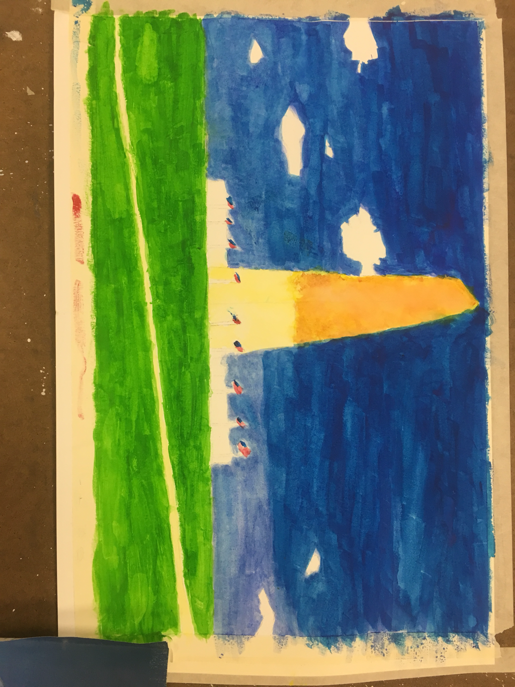 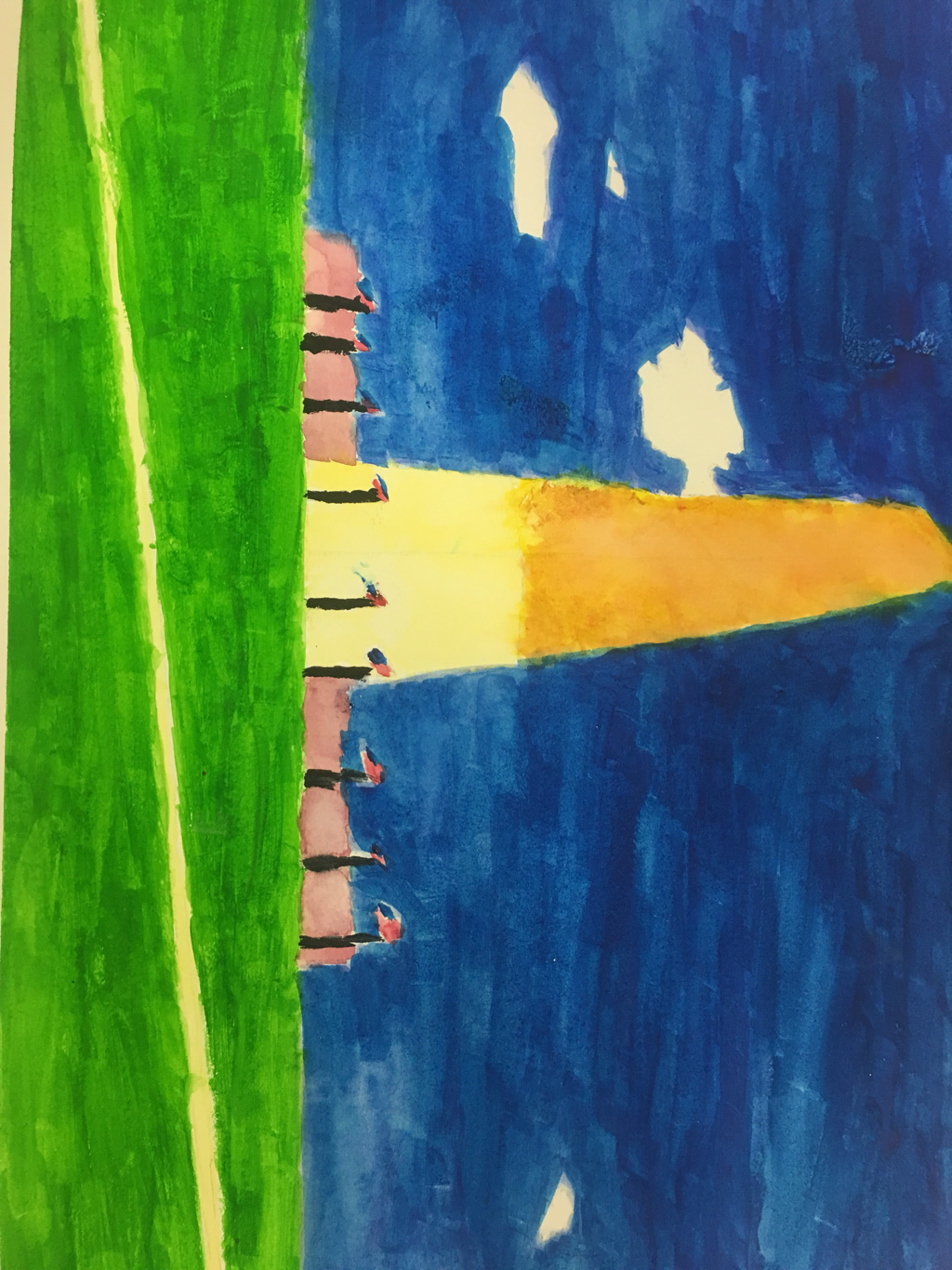   1. For my portrait, I chose to do my older sister. Her name is Madison. 2. I used skittles to create my medium. I chose this because my sister likes candy. 3. At the beginning, I projecting my image with a filter of rainbow, and traces each part out. Then I colored in each part with the colors of skittles. After that I got gluegunned skittles all across the page until I was done. 4. I think in general everything looked good. If I were to change anything I would probably try and rearrange the skittles so that all of them were flat. 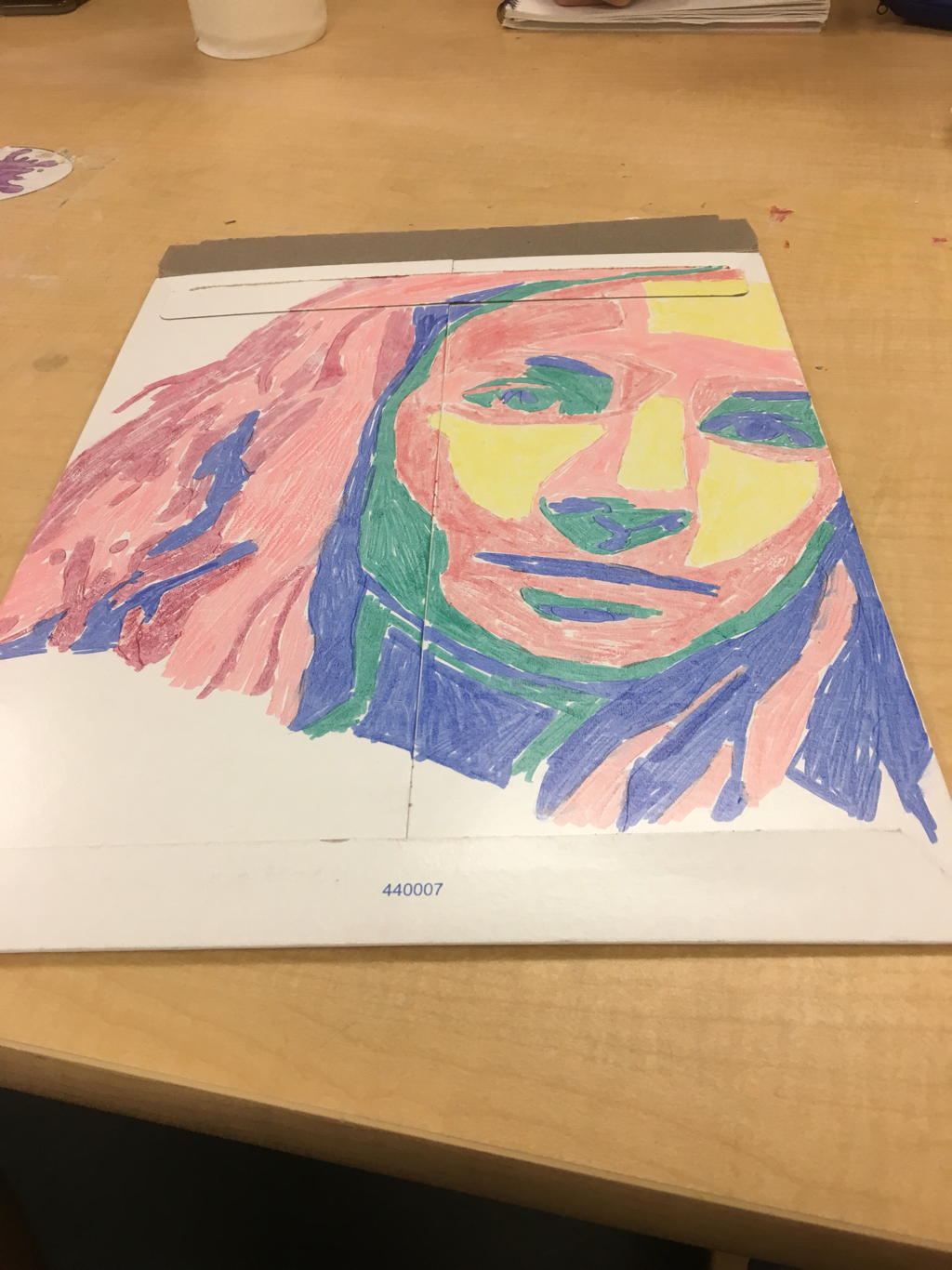 I forgot to take a picture of the piece in finish because it was a Christmas present to her.
1. The proportions warmup helped me the best in this. I didn't know anything about where the parts all go, but now it's easier. 2. I never knew that your forehead was that big. Drawing out the face is was surprising when there was a lot of space left. 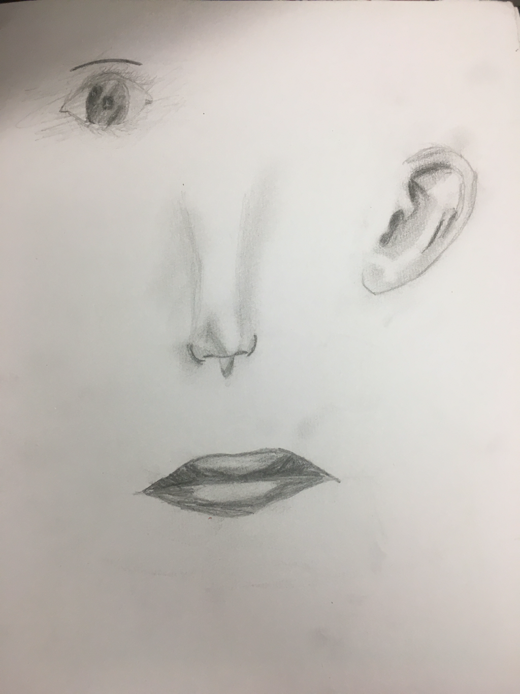 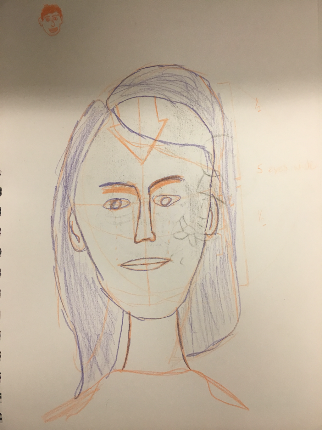   1. After the clay being fired, it was time for me to glaze it. I glazed the seams of the baseball red, and all the inside and outside white. After that, we fired it again and it was finished. 2. I feel like the time I used was successful. We did have a lot of time to work on this, but I didn't need to use all of it since I finished early. 3. If I did this again, I would probably make sure my clay is smooth, and the lid fits all the way. On the inside of the baseball there were a bunch of jagged marks, and not smooth. 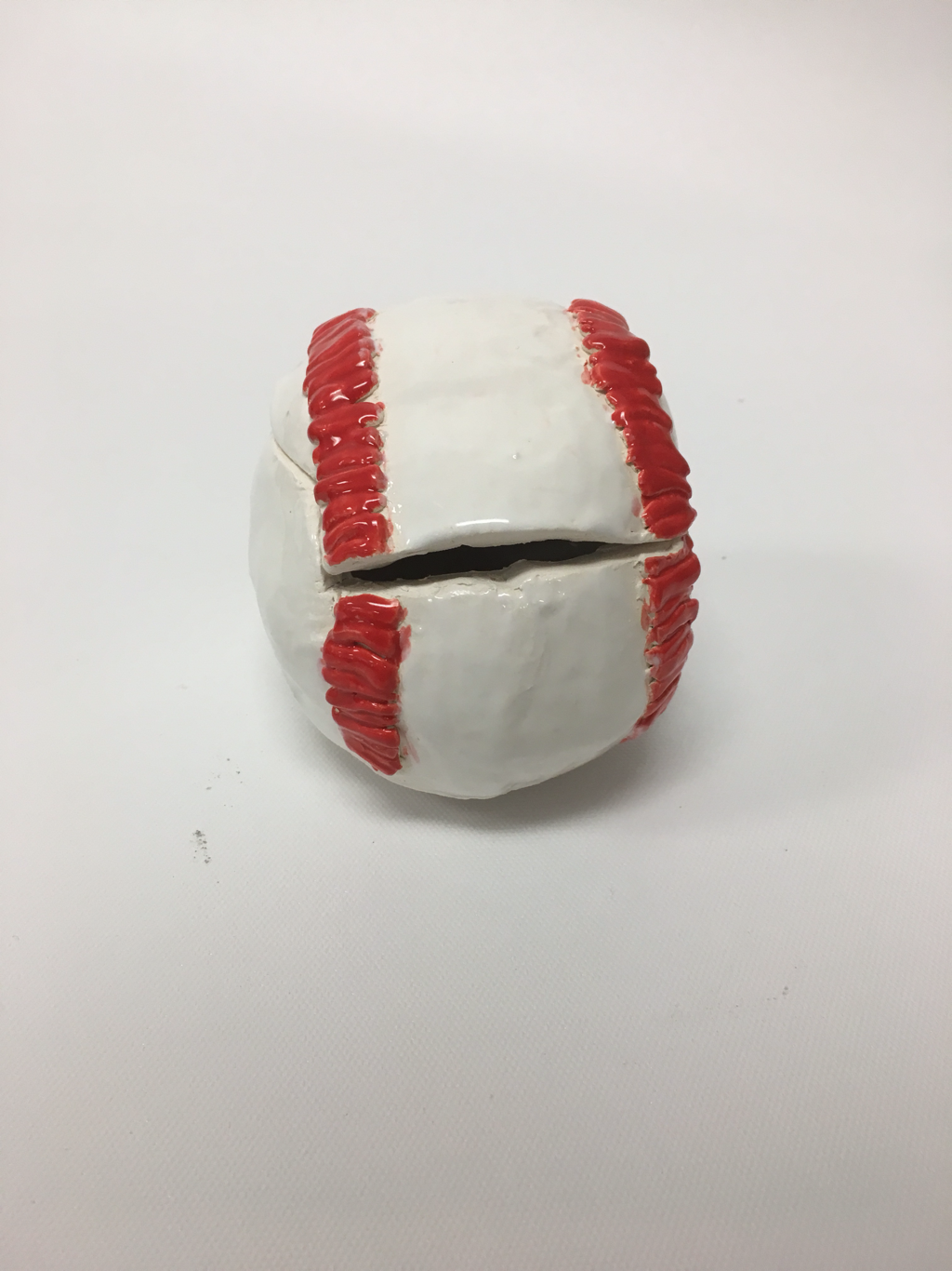 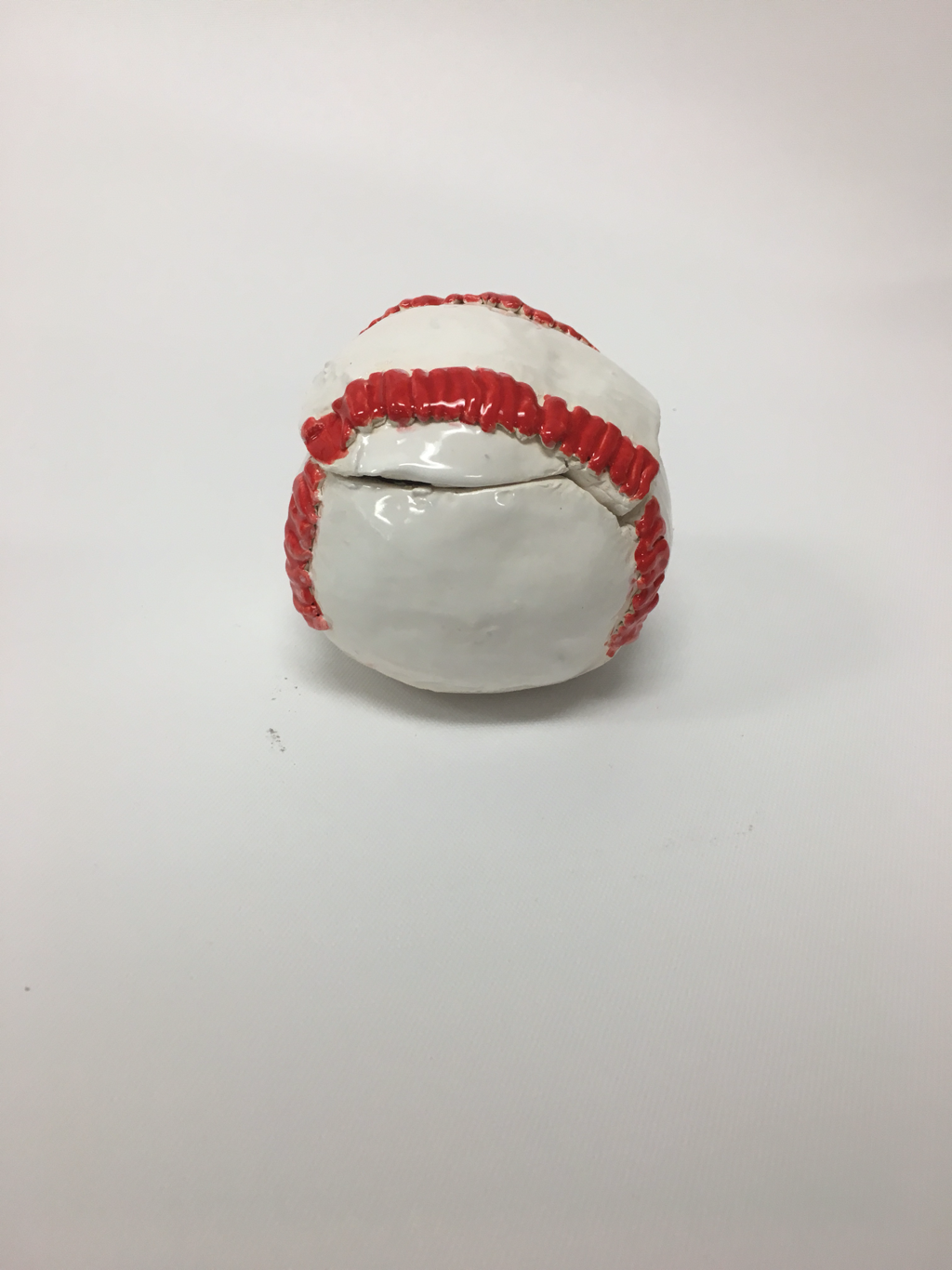 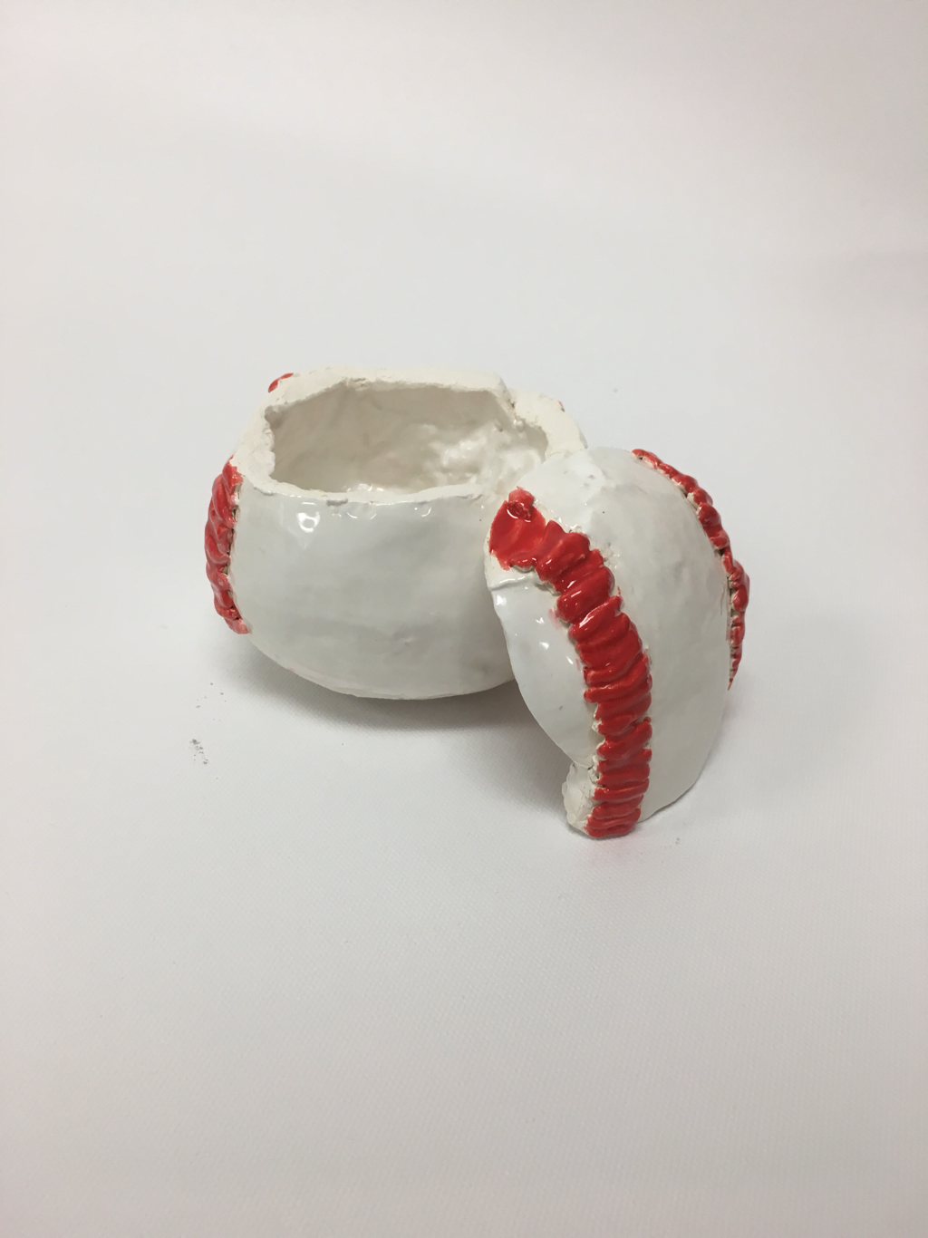 Print - The impression created on a surface by the printing plate.
Inking - the artist applies ink to the plate. This is done with a brayer. Transfer - the paper or other material is pressed against the inked plate, and the ink is transferred to the new surface. Edition - all prints made from the same plate or set of plates form an edition. Relief printing - in this method, the artist cuts away the section of a surface not meant to hold ink. As a result the image is raised from the background. Wood blocking is a Japanese technique which the artist carves into a wood block and uses it as a plate to make many prints. Ando hiroshige, a renowned artist at his time apprenticed as under Hokusai hiroshige as a painter and later became more successful than his role mode. He was the last great artist to work on Ukiyo printmaking and made more than 5,400 prints. 1. The most helpful activity was the sunset. It helped me learn how to do light to darks, and mix the colors with just red, yellow, and blue. 2. I like how everything looks smooth. Nothing is really rough and it looks nice. 3. The difficult thing about watercolor is if you mess up while painting, you can't undo it. 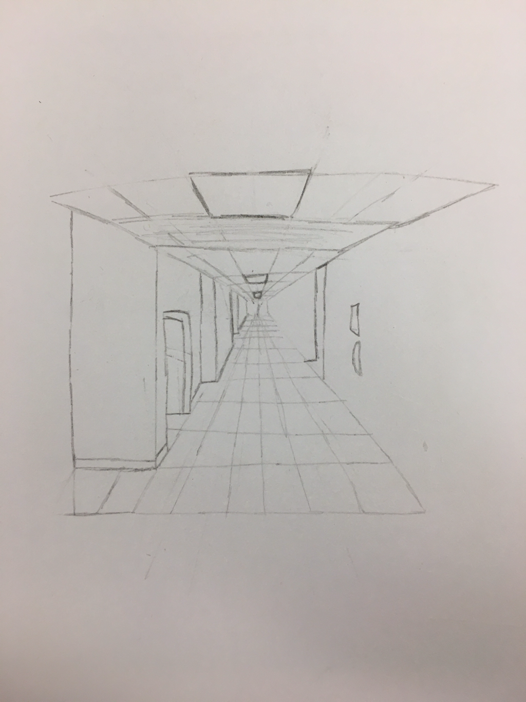 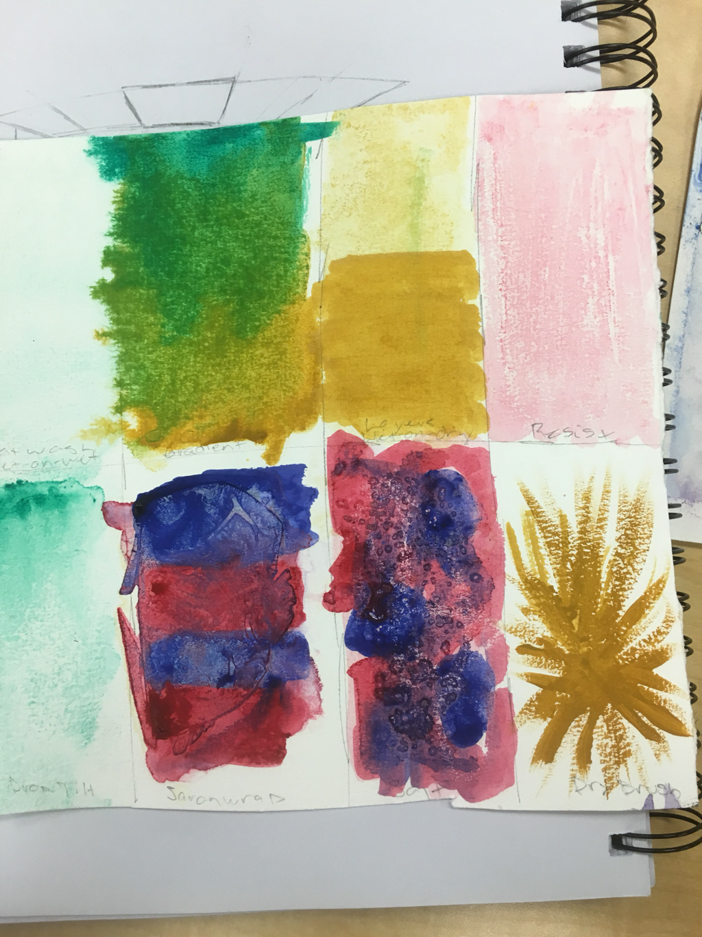 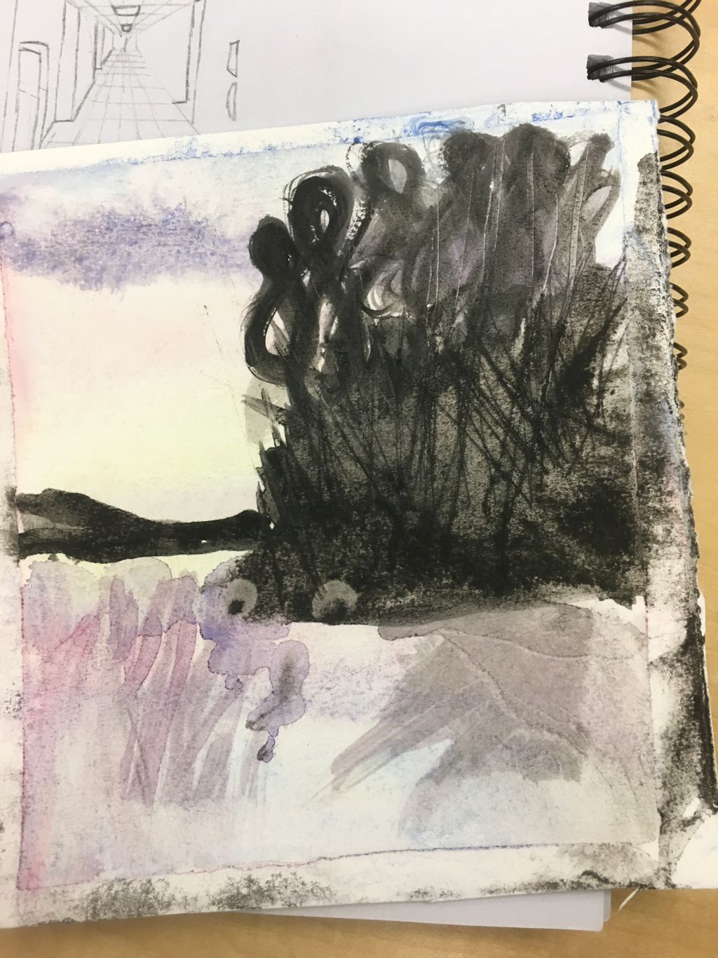  Wash/flat wash - application of watercolor thinned with water, laid smoothly and evenly accross the surface; a flat wash is an even wash of one consistent value Drybrush - a painting technique in which a paint brush that is relatively dry, but still holds paint, is used Glazing - applying glaze on top of the same color darkens the value Graded Wash - wash that gradually changes from dark to light value Hue - when a color is fully saturated Intensity - brightness or dullness Lifting point - removing paint by lifting it off Masking fluid - liquid used to block out areas while you paint
Palette - tray that holds paint Scrubbing - Ddry brush method to lift paint from an area Color temperature - shade of color expressed as kelvin Tint, shade - mixture of color with white, mixture of color with black Transparent - can see through Value - type of color Wet into dry - wet paint applied onto dry paint Wet into wet - wet paint applied onto wet paint Wax resist - a process similar to batik used in painting and printing the salt crystals soak of the paint and creates areas without pigment Watercolor paint - paints are pigments suspended in water in a water-based solution Blotting - using an absorbent material to pick up or lighten an area Watercolor paper - paper in between rough and hot pressed paper Perspective - 1 dimension, 2 dimension, or 3 dimension as a way of looking at a picture |
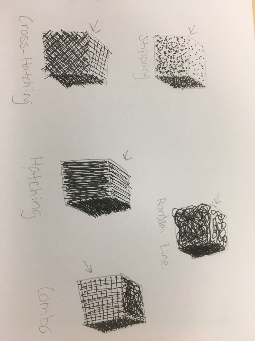
Drawing Unit1. The most helpful warm up to me was the pen cubes because it helped me be able to use different techniques in my art work.
2. Composition is the placement of visual elements or ingredients in a work of art. Value is the element of design that defines the lights and darks in an artwork. 3. The pros of pen is that you can get lots of detail and it looks good. The cons are that you can't erase it. The pros of charcoal is that you can erase it easily if you mess up. The cons are that it gets really messy. The pros of pencil is that there are lots of different types for different shading. The cons are that it can smudge or smear easily. 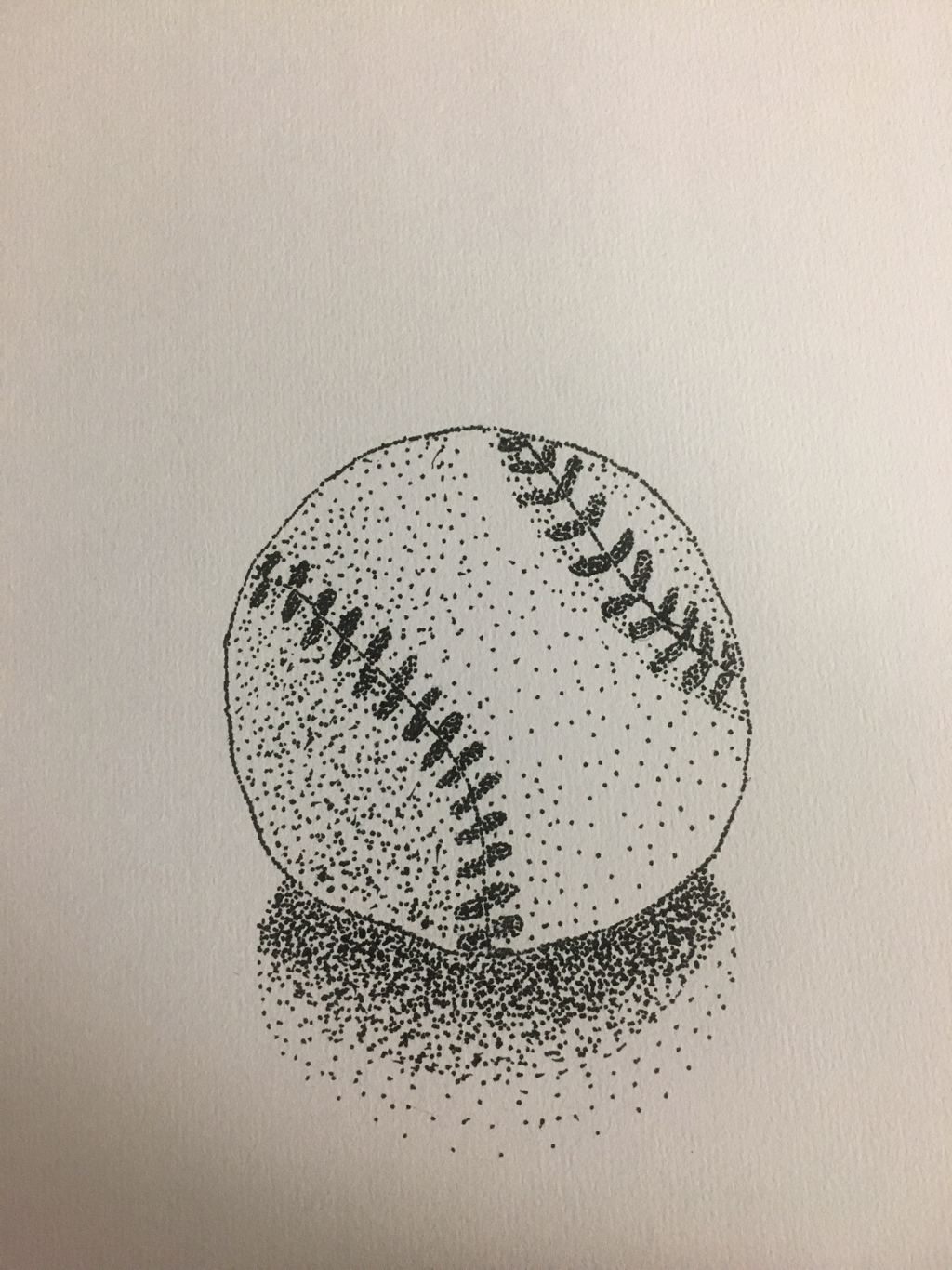
|
Sudkamp Art 1